Thumbnail
| A thumbnail has multiple key functions for your game. The most important two are as a first impression, and as a tool to help recognize your game. A good thumbnail can have a lot of impact on your game’s success on our platform. See one of the success stories of a thumbnail update in the graph here. We’ve listed some best practices below to help you with your design. | 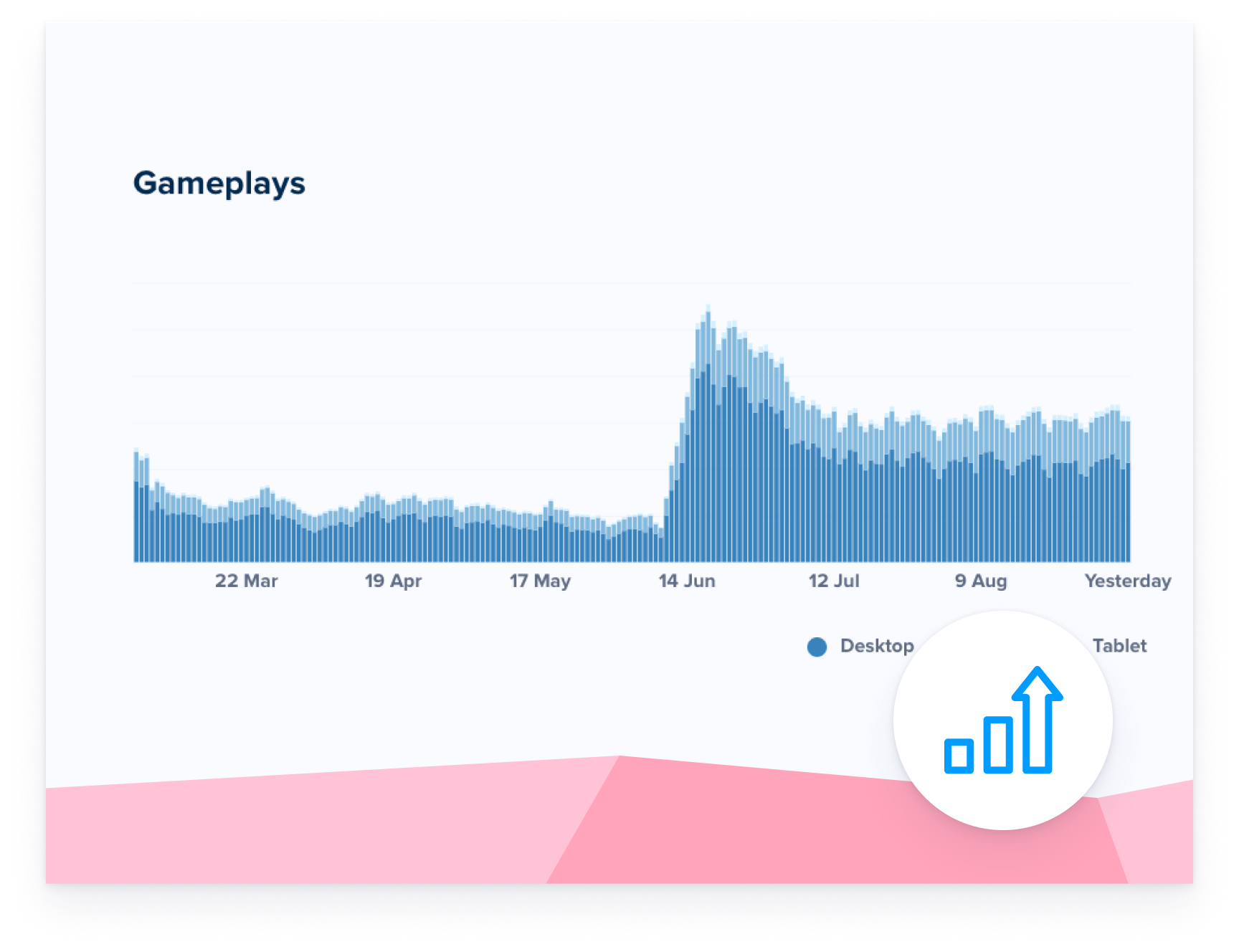 |
Show what’s on the inside
| Your thumbnail should reflect what the game is about. Imagine your thumbnail as a store window. If you sell plants, put a plant in the window. If you sell books, put a book in the window. The visuals in the thumbnail should closely relate to the visuals in your game. If the two don’t relate, players will feel like they’ve been directed to a wrong game and this could hurt conversion to play or gameplay time. | 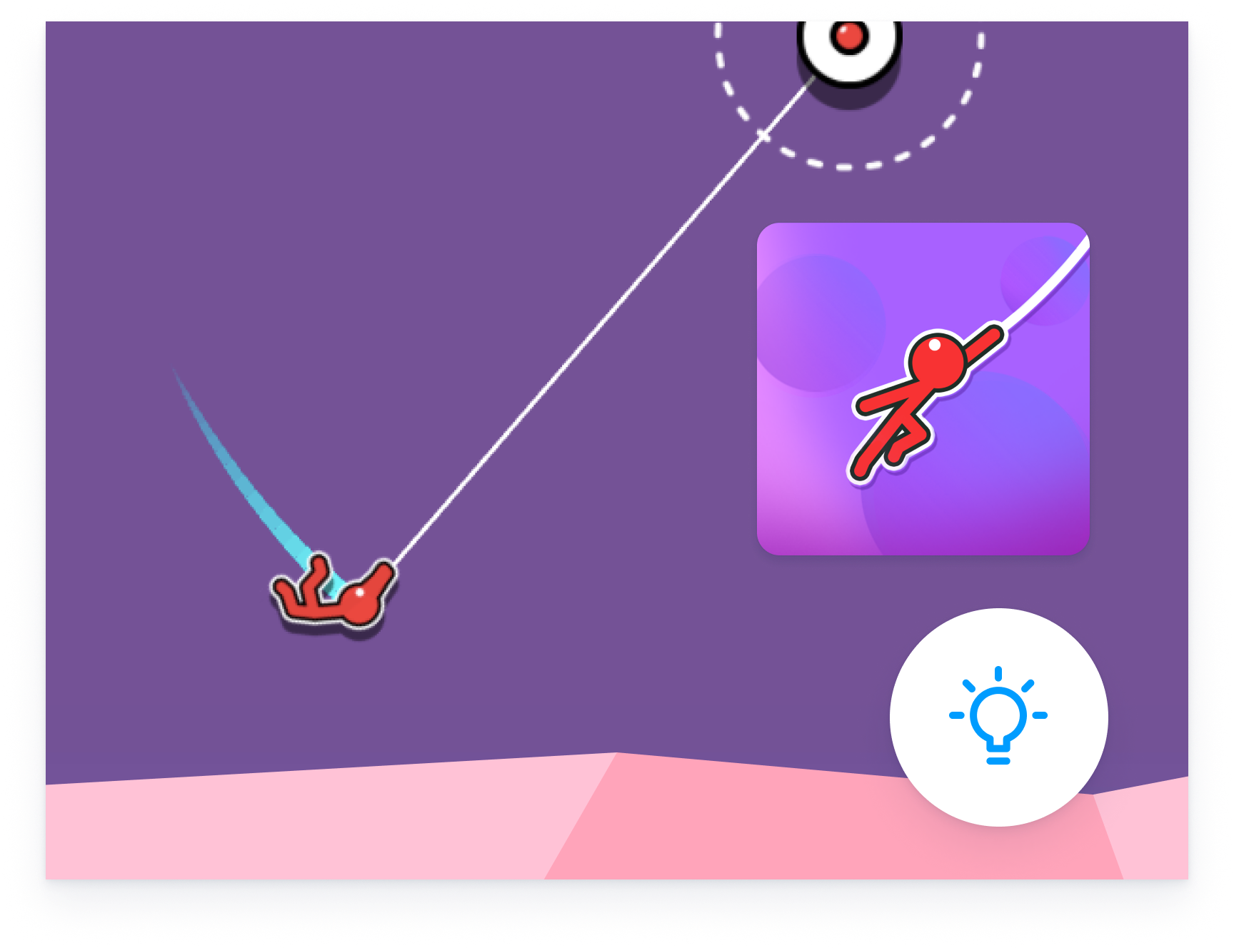 |
Embrace simplicity
| Don’t overcrowd your thumbnail with too many details or ideas. Have one clear foreground object. Stick to the essentials like a main character or an important gameplay element. | 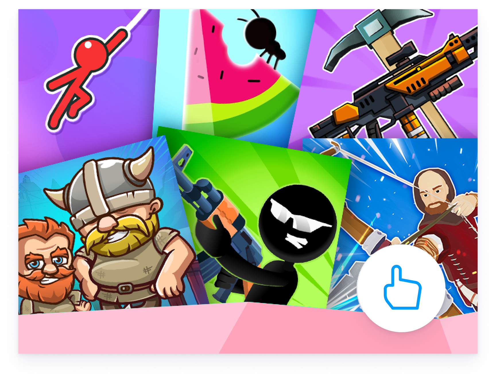 |
Size matters
| Design for small and big game tile sizes: We know it can be tempting to work on a big canvas and show lots of detail. But keep in mind that a lot of detail can look messy in smaller tiles. If you choose to include your game’s title in the thumbnail, make sure the typography remains legible in smaller sizes as well. Notice how the typography becomes unreadable in smaller sizes in this example. | 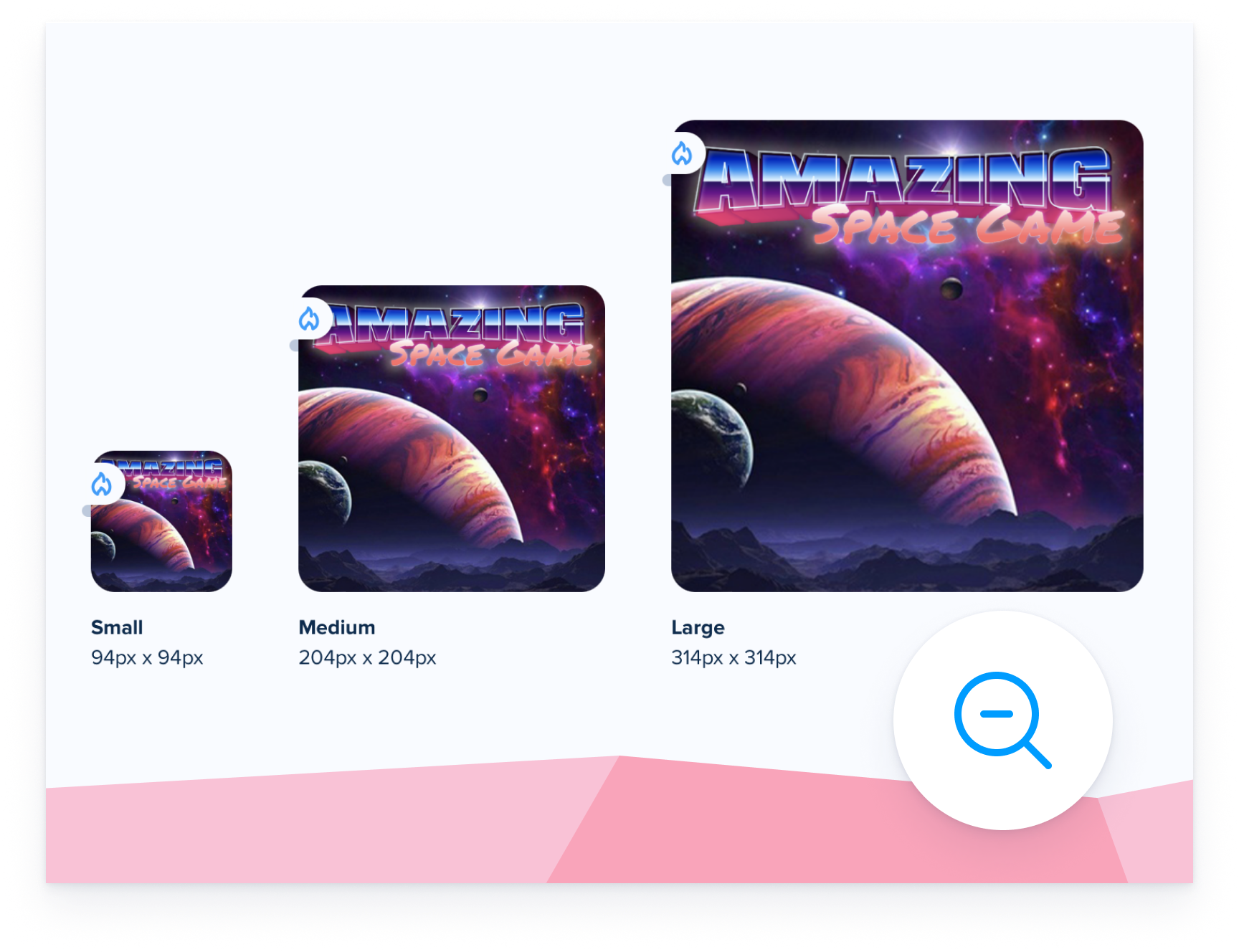 |
Color and contrast
| While creating a colorful thumbnail (or not colorful at all, depending on your game art style) it’s good to keep in mind that some colors are naturally contrasting, and some colors might not register as all that different. Contrast makes things “pop” visually, whereas similar shades might make a thumbnail appear to fall flat. Also keep in mind that the Alphatron Playground background color is #063a5e so make sure your thumbnail is not too similar in color as it might make your thumbnail disappear. | 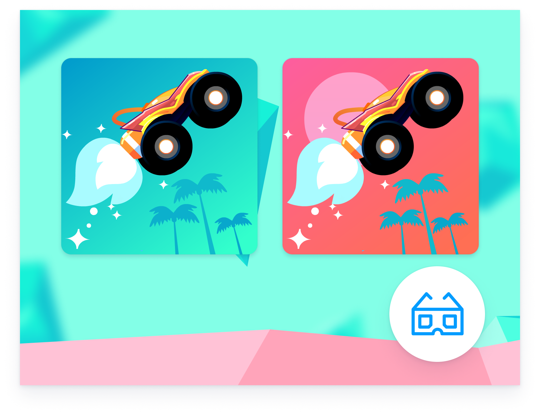 |
Keep it together
| If your game is part of a series or saga, make sure you have continuation in your thumbnails too. Help players recognise thumbnails of the other games in your saga if they enjoyed playing a first entry. | 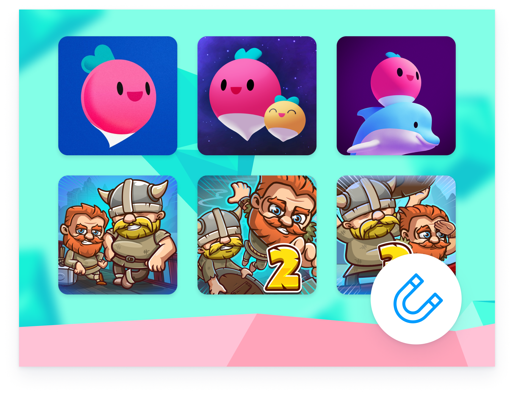 |
Don’t cut corners
| Deliver your thumbnail as a full-bleed square image of at least 628px by 628px. We’ll add the rounded corners as an image mask on our end. | 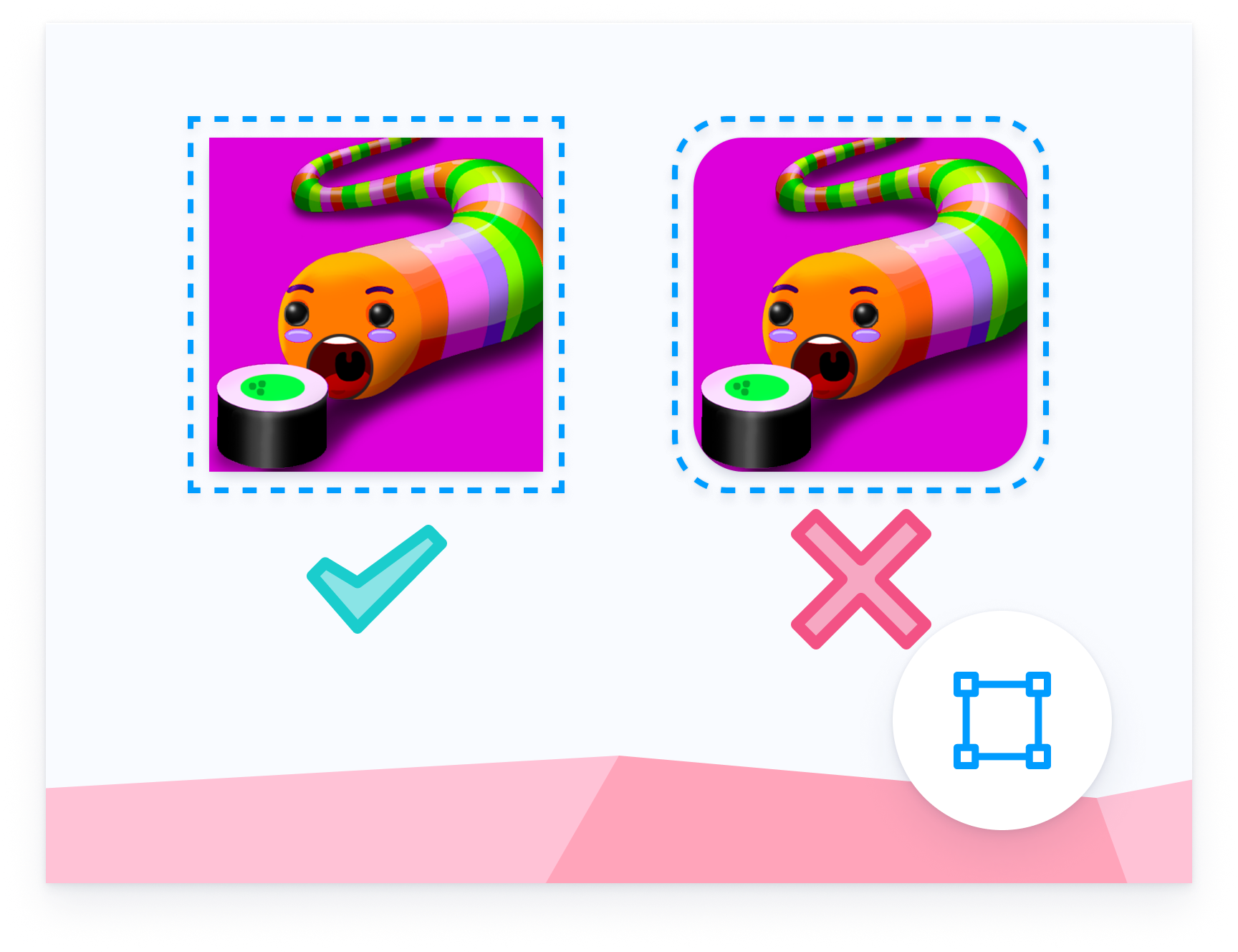 |